
*Go on. You can tell me.
'This perennial restlessness. It is ruining me. It keeps my past alive, it clouds my future and is crushing my present. It lies awake; oscillating between deep nostalgia, agonizing regrets, fierce anxiety and unwarranted depression.. Such a profound sense of rejection, desperation and hopelessness. Nothing calms me down. Nothing. No place gives the warmth of a home, not even home itself. A constant grief whose source or reason is unknown to me. They say that it shall be over soon, it shall pass. But here I am; even after all these years it is still the same. Every day is an ordeal, like some kind of a trial. And I just cannot find a cure for this suffering.'
*Suffering is a good place to start, because everyone believes that he suffers in one way or the other. The Buddha taught that all are in suffering, because that is where everyone thinks he is. His own quest began by seeing suffering in his own city. He saw a sick man, an old man, a dead body and became aware of the suffering that his family was trying so hard to protect him from. He formulated a teaching that started from the statement that all are in suffering, and then he taught a way by which that suffering could be ended. When you believe in a myth, you have to start with that myth and then move away from it. This dream world you live in is a myth, a fantasy. Since you take it to be true, I will accept your complaint that you are suffering in it and I will give you advice on how to end your suffering and become free. But while I am telling you all this, never for a moment do I actually accept that you are really suffering, nor will I ever accept that the world you claim you are living in is in any way real. For you this myth is true. Samsara, creation, all gods: they are all real for you because you have not seen through the myth you have imposed on yourself. And we spoke about it, didn’t we? About the pointlessness of the ‘I’ in our thoughts and actions. We will return to it later. But for now, talk. Let it flow.

'Her dreams of future were pure and simple. The dreams of youth. She was young and simply wanted to learn, travel, see the world and be happy. Today she says 'This gruelling pursuit of happiness leaves you with nothing to be happy about.''


'There were some problems between them. We discussed about it a number of times but for various reasons, I just couldn’t help them. When I was leaving, they came to drop me off at the airport. She was shaking as if having a panic attack. She said, “I am scared, too scared to even imagine what might happen”. I hugged her and urged her to be strong. I remember saying, “Don’t worry, this storm should be over soon. When we meet again, you might not even remember any of the problems that you are facing right now”. But we couldn’t meet again. Three months later she took her own life.'

'How comforting it must be to have a good night’s sleep. But I feel like I haven’t slept at all in the past decade or so. As if I lost my sleep; kept it somewhere and now I can’t find it. The moon rises, there is silence all around, yet I just can’t shut off the noise inside my head. I just keep looking at the cold sky, the twinkling stars, the gliding airplanes, the translucent moon..'

'They complain that I talk to myself during the night and it disturbs their sleep. So sometimes I just go out in the garden to breathe. But the funny thing is that as soon as I am out there, I feel sleepy. And when I return to my bed, the drowsiness just disappears. Then I feel like going out again. In the morning they say they couldn’t sleep well because I kept moving in and out of the house.'
'But there is nothing more beautiful than to witness the Sun rising in the morning. Especially an early spring sunrise. The soft cold air and the warm golden light. Sometimes you can see the moon too. Such a wonderful sight it is.'

'It happens a lot of times; I think the atmosphere plays a very important role in it. Especially some kind of a spiritual environment. You can look at yourself like you can look at some other person. Like you have just walked out of your body and you can watch whatever you are doing or is happening to you. Like you have two bodies, or souls; one which is right there as your regular self and the other one that floats around, observes you and knows what is going to happen next.'

'Is this also one of the reasons why it is difficult to forget people, places and times spent with them? Is that why these memories are as strong as if it all happened just yesterday? Because you have lived them twice. Once as yourself, and then as someone else who was looking at you, observing and taking notes of your acts, behavior and emotions. You are the examiner and you are the examinee. You are the one who demands to move on and you are the one who pleads to stay.'

'She had the spare keys to my apartment. I would often return home to see her wrapped in my jacket napping on my couch.'

'Her kohl-laden emerald eyes always gave away her secrets. She would pretend to be happy but all I saw was a deep quiet search in her eyes. Like soul mates, we could spend all our time together, talking about almost anything and everything. And we also could sit together quietly forever.'

'Times when you connect intuitively; you immediately feel associated with their lives, experiences and feelings even when you don’t know anything about them. Sometimes it is the look in their eyes and sometimes it is just the way they walk. But you want to talk to them, tell them your stories and forge bonds. And then it becomes a habit. But you forget that there is only so much that you can take.'

'Alone, empty and abandoned. No one waiting for you as you walk inside. You want to be with someone, hug someone and just lie down for a bit with your eyes closed. But there is no one there. No one calls. You go to bed but you can’t sleep. Somehow you survive a night full of memories and melancholy. The alarm goes off in the morning. But you are already awake.'


'An artist? No, an escapist; that is what you are! Always running away from your responsibilities; just another individual with an average intelligence, mediocre abilities and a huge ego. So please get a job and help your self out of this self-induced misery and struggle. You can’t be like this forever. So shake off this false pretence and open your eyes to the realities of life. '

*Look around; there are millions of people who suffer from hunger, disease, neglect and abuse. You seek to get rid of your pain. But if this desire ignores the sufferings of others, nothing will pull you out of this cesspit of despair. And if you seek to alleviate the sufferings of others, no matter how dark the night might be, there is always going to be a Light that will guide you towards the right path. And that Light will come from within, from somewhere deep inside your own self. As He said, ‘Do not seek the Light, realize that you are the Light’.


'You know that there is nothing there that would make sense to a normal eye. But you keep looking. Looking until something does appear and you start identifying with it in some way or the other. Like the faces we start seeing in clouds or on walls. As if one isn’t satisfied with what is real and, therefore, is in a constant search for an alternate reality, or a parallel universe, where every feeling has a face and every silence has a meaning.'


'It is nothing but simply a matter of perspective. Depends upon where you stand and what you choose to see. You claim that you are being punished for doing what you love. Ask me, I feel like I am being punished by being forced to do what I don’t love.'

I was reading about animals a while back and there was this motherfucking scientist in France back in the thirties or forties or whenever the motherfuck it was and he was trying to get apes to draw these pictures, to make art pictures like the kinds of pictures in serious motherfucking paintings that you see in museums and shit. So the scientist keeps showing the apes these paintings and giving them charcoal pencils to draw with and then one day one of the apes finally draws something but it’s not the art pictures that it draws. What it draws is the bars of its own motherfucking cage. Its own motherfucking cage! Man, that's the truth, ain't it?
― Cheryl Strayed, Wild: From Lost to Found on the Pacific Crest Trail


'The kind of love where you keep kissing each other for no reason. Standing in opposite corners in a room full of noisy friends and loud music, you keep looking at each other and then you walk up to her and whisper something in her ears. And she laughs and says, ‘Silly boy, you are so predictable’.'

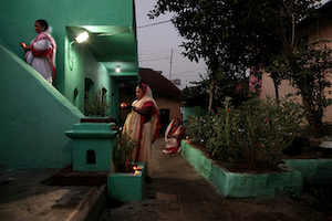
'And then I see her pray. I witness immense glory in the quietness of her mind, in the purity of her heart and in the faith of her soul. As if the entire energy that drives this universe is right there in front of me, squeezed into this tiny fragile moment.'


'You do not know how to swim. But you want to know how deep this lake is? You have heard that you cannot hold your breath for more than 87 seconds underwater. Then water floods your lungs, your body oxygen depletes, you start sinking and you can’t fight back. Soon you see a bunch of people staring at your pathetic lifeless body. And then you see your mother. And that broken helpless look in her eyes. She gave you your life. She gave away her everything for you. Why? Only to see you drown and kill yourself? And then she says, “You could have simply come back to me and everything would have been alright”.'

One of the first signs of the beginning of understanding is the wish to die. This life appears unbearable, another unattainable. One is no longer ashamed of wanting to die; one asks to be moved from the old cell, which one hates, to a new one, which one will only in time come to hate. In this there is also a residue of belief that during the move the master will chance to come along the corridor, look at the prisoner and say: "This man is not to be locked up again, He is to come with me.”
― Franz Kafka, Blue Octavo Notebooks

I would suggest that the prisons I incessantly create are not designed to lock me in, rather they are designed to lock the world out. And the oddity is that either way, I am a prisoner who has sentenced himself to a prison within which I do not belong.”
― Craig D. Lounsbrough


*What you carry within are regrets; alive, fiery and numerous regrets. They have been holding you back and that is why nothing makes you happy or satisfied. So please, stop holding on to these regrets; your regrets about your parents, your career, your love, your life. Make an active effort to forgive and forget. Let me read this out for you, ‘When you forgive you release critical judgment of yourself as well as others. You lighten up. You do not cling to negative experiences that resulted from decisions that you made while you were learning. That is regret. Regret is the double negativity of clinging to negativity. You lose power when you regret. If one person grieves at his or her experiences while another is able to laugh, who is the lighter? Which is harmless? The heart that dances is the innocent heart. The one that cannot laugh is burdened. It is the dancing heart that is harmless.'

'Would that help me to get rid of this pain?'
*What would you say if I told you that the source of this pain lies in your stubbornness to follow your idea of how things have to be like? What if all this while you have been ignoring what the Divine’s will is? What if you realized that all this while you have been trying to contradict the Divine’s plan?
'I believe that if I want something, and if I deserve it, I will have to work hard for it and that’s what I am trying to do. But how can I know what the Divine’s will or plan is?'
*First you have to understand what I mean by following the ‘Divine’s will’. You have to stop imposing your mind and vital will on the Divine. You should instead prepare to receive the Divine’s will and acquire the ability to follow it. You should not say, "This is my right, want, claim, need, requirement and why am I not getting it?" Instead, the better way is to surrender oneself and receive with complete satisfaction and joy whatever the Divine gives. You should not revolt, grieve or reject. This way, whatever you receive will be the right thing for you.
'And then how does one know what the Divine’s will is?'
*She says one does not know it, one feels it. And in order to feel it, one must will with such intensity, such sincerity, that every obstacle disappears. As long as you have a preference, a desire, an attraction, a liking, all these veil the Truth from you. Hence, the first thing to do is to try to master, govern, correct all the movements of your consciousness and eliminate those which cannot be changed until all becomes a perfect and permanent expression of the Truth.

*She further says that when She accepted Him as her guide, he emphasized the need for humility which disclaims the flaunting of one’s gifts or achievements. He said that every artist has got something of the public man in him which makes him crave for the stimulus of an audience, social applause, satisfied vanity, fame, etc. All that must go and his art should be a service not of man or of his own ego but of the Divine. You have to surrender your complete self to the Divine.


'But then what about the philosophy of working towards one’s objective or goal? Does that mean that I should do nothing at all and not pursue whatever that is difficult to achieve or stop trying if it cannot be attained in the first attempt.'
*If you surrender you have to give up effort but that does not mean that you abandon all willed action. On the contrary, you should hasten the realization by lending your will to the Divine will. That too is surrender in another form. But what is required of you is not passive surrender where you end up being a rigid block. Instead, you have to put your will at the disposal of the Divine Will. You have a will and you can offer that will. If you are surrendering passively, you will sit idle and say let the Divine tell me what to do. But if you have truly surrendered, you will develop an attitude that will help you say, “ I give my will to the Divine. I intensely want to do this. But I do not have the knowledge, let the Divine Will work it out for me.” Your will must continue to act steadily, not in the way of choosing a particular action or demanding a particular object, but as an ardent aspiration concentrated upon the end to be achieved. This is the first step. If you are vigilant, if your attention is alert, you will eventually receive something in the form of an inspiration of what is to be done. Only, you must remember that to surrender is to accept whatever is the result of your action, though the result may be quite different from what you expect. On the other hand, if your surrender is passive, you will do nothing and try nothing; you will simply go to sleep and wait for a miracle. And to know whether your will or desire is in agreement with the Divine Will or not, you must look and see whether you have an answer or not, whether you feel supported or contradicted, not by the mind or the vital or the body, but by that something which is always there deep in the inner being, in your heart.

*Some people came from the south to see Him; for His darśana.

'But then how does one deal with this urge of – as you say – ‘not staying still’. The feeling of going everywhere, doing everything and being with everyone.'
*Know that all human beings are made up of a combination of several entities that come together, sometimes organizing themselves and completing each other, sometimes opposing and contradicting one another. An "entity" is a personality or an individuality. There are many such "personalities" in each one of us. If these personalities agree and are complementary with one another, they make up a human being, a rich and complex "person". If the personalities do not agree, this person's life will be incoherent, and that is not unusual: in fact, these cases are very common. For example, one of the personalities might wish to make some progress, to become more and more perfect, to get a deeper knowledge of things, to realize more and more, to proceed towards the perfection of the being, while another one may simply want to have fun and enjoy itself as much as it can; one day it will do this, the next day something else, etc. A person may have a great many personalities or individualities within him--ten or twenty, for example--and each one has its own destiny. What happens then? Conflicts, friction, inner disorder created by these individualities which are unable to get on with one another. The strongest one gets the upper hand; it is not only dominant over the others but curbs them to stop them from rebelling. So, in the end, the unlucky ones, the repressed ones, go to sleep. They bide their time, and when that time comes, they suddenly jump up and turn everything upside down. If that happens very often, that person's life will be a very disorderly one. He will take up one thing today and go on with another tomorrow and so on. A truly harmonious personality implies a conscious arrangement of the inner individualities. This arrangement is achieved by means of a discipline, a proper education. But to succeed in this one must consciously take the psychic being as the centre and arrange, harmonize the various individualities around it. True harmony or inner organization is the result of such a persistent effort.

'This perennial restlessness. It is ruining me. It keeps my past alive, it clouds my future and is crushing my present. It lies awake; oscillating between deep nostalgia, agonizing regrets, fierce anxiety and unwarranted depression.. Such a profound sense of rejection, desperation and hopelessness. Nothing calms me down. Nothing. No place gives the warmth of a home, not even home itself. A constant grief whose source or reason is unknown to me. They say that it shall be over soon, it shall pass. But here I am; even after all these years it is still the same. Every day is an ordeal, like some kind of a trial. And I just cannot find a cure for this suffering.'
*Suffering is a good place to start, because everyone believes that he suffers in one way or the other. The Buddha taught that all are in suffering, because that is where everyone thinks he is. His own quest began by seeing suffering in his own city. He saw a sick man, an old man, a dead body and became aware of the suffering that his family was trying so hard to protect him from. He formulated a teaching that started from the statement that all are in suffering, and then he taught a way by which that suffering could be ended. When you believe in a myth, you have to start with that myth and then move away from it. This dream world you live in is a myth, a fantasy. Since you take it to be true, I will accept your complaint that you are suffering in it and I will give you advice on how to end your suffering and become free. But while I am telling you all this, never for a moment do I actually accept that you are really suffering, nor will I ever accept that the world you claim you are living in is in any way real. For you this myth is true. Samsara, creation, all gods: they are all real for you because you have not seen through the myth you have imposed on yourself. And we spoke about it, didn’t we? About the pointlessness of the ‘I’ in our thoughts and actions. We will return to it later. But for now, talk. Let it flow.
'Her dreams of future were pure and simple. The dreams of youth. She was young and simply wanted to learn, travel, see the world and be happy. Today she says 'This gruelling pursuit of happiness leaves you with nothing to be happy about.''
'There were some problems between them. We discussed about it a number of times but for various reasons, I just couldn’t help them. When I was leaving, they came to drop me off at the airport. She was shaking as if having a panic attack. She said, “I am scared, too scared to even imagine what might happen”. I hugged her and urged her to be strong. I remember saying, “Don’t worry, this storm should be over soon. When we meet again, you might not even remember any of the problems that you are facing right now”. But we couldn’t meet again. Three months later she took her own life.'
'How comforting it must be to have a good night’s sleep. But I feel like I haven’t slept at all in the past decade or so. As if I lost my sleep; kept it somewhere and now I can’t find it. The moon rises, there is silence all around, yet I just can’t shut off the noise inside my head. I just keep looking at the cold sky, the twinkling stars, the gliding airplanes, the translucent moon..'
'They complain that I talk to myself during the night and it disturbs their sleep. So sometimes I just go out in the garden to breathe. But the funny thing is that as soon as I am out there, I feel sleepy. And when I return to my bed, the drowsiness just disappears. Then I feel like going out again. In the morning they say they couldn’t sleep well because I kept moving in and out of the house.'
'But there is nothing more beautiful than to witness the Sun rising in the morning. Especially an early spring sunrise. The soft cold air and the warm golden light. Sometimes you can see the moon too. Such a wonderful sight it is.'
'It happens a lot of times; I think the atmosphere plays a very important role in it. Especially some kind of a spiritual environment. You can look at yourself like you can look at some other person. Like you have just walked out of your body and you can watch whatever you are doing or is happening to you. Like you have two bodies, or souls; one which is right there as your regular self and the other one that floats around, observes you and knows what is going to happen next.'
'Is this also one of the reasons why it is difficult to forget people, places and times spent with them? Is that why these memories are as strong as if it all happened just yesterday? Because you have lived them twice. Once as yourself, and then as someone else who was looking at you, observing and taking notes of your acts, behavior and emotions. You are the examiner and you are the examinee. You are the one who demands to move on and you are the one who pleads to stay.'
'She had the spare keys to my apartment. I would often return home to see her wrapped in my jacket napping on my couch.'
'Her kohl-laden emerald eyes always gave away her secrets. She would pretend to be happy but all I saw was a deep quiet search in her eyes. Like soul mates, we could spend all our time together, talking about almost anything and everything. And we also could sit together quietly forever.'
'Times when you connect intuitively; you immediately feel associated with their lives, experiences and feelings even when you don’t know anything about them. Sometimes it is the look in their eyes and sometimes it is just the way they walk. But you want to talk to them, tell them your stories and forge bonds. And then it becomes a habit. But you forget that there is only so much that you can take.'
'Alone, empty and abandoned. No one waiting for you as you walk inside. You want to be with someone, hug someone and just lie down for a bit with your eyes closed. But there is no one there. No one calls. You go to bed but you can’t sleep. Somehow you survive a night full of memories and melancholy. The alarm goes off in the morning. But you are already awake.'
'An artist? No, an escapist; that is what you are! Always running away from your responsibilities; just another individual with an average intelligence, mediocre abilities and a huge ego. So please get a job and help your self out of this self-induced misery and struggle. You can’t be like this forever. So shake off this false pretence and open your eyes to the realities of life. '
*Look around; there are millions of people who suffer from hunger, disease, neglect and abuse. You seek to get rid of your pain. But if this desire ignores the sufferings of others, nothing will pull you out of this cesspit of despair. And if you seek to alleviate the sufferings of others, no matter how dark the night might be, there is always going to be a Light that will guide you towards the right path. And that Light will come from within, from somewhere deep inside your own self. As He said, ‘Do not seek the Light, realize that you are the Light’.
'You know that there is nothing there that would make sense to a normal eye. But you keep looking. Looking until something does appear and you start identifying with it in some way or the other. Like the faces we start seeing in clouds or on walls. As if one isn’t satisfied with what is real and, therefore, is in a constant search for an alternate reality, or a parallel universe, where every feeling has a face and every silence has a meaning.'
'It is nothing but simply a matter of perspective. Depends upon where you stand and what you choose to see. You claim that you are being punished for doing what you love. Ask me, I feel like I am being punished by being forced to do what I don’t love.'
I was reading about animals a while back and there was this motherfucking scientist in France back in the thirties or forties or whenever the motherfuck it was and he was trying to get apes to draw these pictures, to make art pictures like the kinds of pictures in serious motherfucking paintings that you see in museums and shit. So the scientist keeps showing the apes these paintings and giving them charcoal pencils to draw with and then one day one of the apes finally draws something but it’s not the art pictures that it draws. What it draws is the bars of its own motherfucking cage. Its own motherfucking cage! Man, that's the truth, ain't it?
― Cheryl Strayed, Wild: From Lost to Found on the Pacific Crest Trail
'The kind of love where you keep kissing each other for no reason. Standing in opposite corners in a room full of noisy friends and loud music, you keep looking at each other and then you walk up to her and whisper something in her ears. And she laughs and says, ‘Silly boy, you are so predictable’.'
'And then I see her pray. I witness immense glory in the quietness of her mind, in the purity of her heart and in the faith of her soul. As if the entire energy that drives this universe is right there in front of me, squeezed into this tiny fragile moment.'
'You do not know how to swim. But you want to know how deep this lake is? You have heard that you cannot hold your breath for more than 87 seconds underwater. Then water floods your lungs, your body oxygen depletes, you start sinking and you can’t fight back. Soon you see a bunch of people staring at your pathetic lifeless body. And then you see your mother. And that broken helpless look in her eyes. She gave you your life. She gave away her everything for you. Why? Only to see you drown and kill yourself? And then she says, “You could have simply come back to me and everything would have been alright”.'
One of the first signs of the beginning of understanding is the wish to die. This life appears unbearable, another unattainable. One is no longer ashamed of wanting to die; one asks to be moved from the old cell, which one hates, to a new one, which one will only in time come to hate. In this there is also a residue of belief that during the move the master will chance to come along the corridor, look at the prisoner and say: "This man is not to be locked up again, He is to come with me.”
― Franz Kafka, Blue Octavo Notebooks
I would suggest that the prisons I incessantly create are not designed to lock me in, rather they are designed to lock the world out. And the oddity is that either way, I am a prisoner who has sentenced himself to a prison within which I do not belong.”
― Craig D. Lounsbrough
*What you carry within are regrets; alive, fiery and numerous regrets. They have been holding you back and that is why nothing makes you happy or satisfied. So please, stop holding on to these regrets; your regrets about your parents, your career, your love, your life. Make an active effort to forgive and forget. Let me read this out for you, ‘When you forgive you release critical judgment of yourself as well as others. You lighten up. You do not cling to negative experiences that resulted from decisions that you made while you were learning. That is regret. Regret is the double negativity of clinging to negativity. You lose power when you regret. If one person grieves at his or her experiences while another is able to laugh, who is the lighter? Which is harmless? The heart that dances is the innocent heart. The one that cannot laugh is burdened. It is the dancing heart that is harmless.'
'Would that help me to get rid of this pain?'
*What would you say if I told you that the source of this pain lies in your stubbornness to follow your idea of how things have to be like? What if all this while you have been ignoring what the Divine’s will is? What if you realized that all this while you have been trying to contradict the Divine’s plan?
'I believe that if I want something, and if I deserve it, I will have to work hard for it and that’s what I am trying to do. But how can I know what the Divine’s will or plan is?'
*First you have to understand what I mean by following the ‘Divine’s will’. You have to stop imposing your mind and vital will on the Divine. You should instead prepare to receive the Divine’s will and acquire the ability to follow it. You should not say, "This is my right, want, claim, need, requirement and why am I not getting it?" Instead, the better way is to surrender oneself and receive with complete satisfaction and joy whatever the Divine gives. You should not revolt, grieve or reject. This way, whatever you receive will be the right thing for you.
'And then how does one know what the Divine’s will is?'
*She says one does not know it, one feels it. And in order to feel it, one must will with such intensity, such sincerity, that every obstacle disappears. As long as you have a preference, a desire, an attraction, a liking, all these veil the Truth from you. Hence, the first thing to do is to try to master, govern, correct all the movements of your consciousness and eliminate those which cannot be changed until all becomes a perfect and permanent expression of the Truth.
'But then what about the philosophy of working towards one’s objective or goal? Does that mean that I should do nothing at all and not pursue whatever that is difficult to achieve or stop trying if it cannot be attained in the first attempt.'
*If you surrender you have to give up effort but that does not mean that you abandon all willed action. On the contrary, you should hasten the realization by lending your will to the Divine will. That too is surrender in another form. But what is required of you is not passive surrender where you end up being a rigid block. Instead, you have to put your will at the disposal of the Divine Will. You have a will and you can offer that will. If you are surrendering passively, you will sit idle and say let the Divine tell me what to do. But if you have truly surrendered, you will develop an attitude that will help you say, “ I give my will to the Divine. I intensely want to do this. But I do not have the knowledge, let the Divine Will work it out for me.” Your will must continue to act steadily, not in the way of choosing a particular action or demanding a particular object, but as an ardent aspiration concentrated upon the end to be achieved. This is the first step. If you are vigilant, if your attention is alert, you will eventually receive something in the form of an inspiration of what is to be done. Only, you must remember that to surrender is to accept whatever is the result of your action, though the result may be quite different from what you expect. On the other hand, if your surrender is passive, you will do nothing and try nothing; you will simply go to sleep and wait for a miracle. And to know whether your will or desire is in agreement with the Divine Will or not, you must look and see whether you have an answer or not, whether you feel supported or contradicted, not by the mind or the vital or the body, but by that something which is always there deep in the inner being, in your heart.
*Some people came from the south to see Him; for His darśana.
*Know that all human beings are made up of a combination of several entities that come together, sometimes organizing themselves and completing each other, sometimes opposing and contradicting one another. An "entity" is a personality or an individuality. There are many such "personalities" in each one of us. If these personalities agree and are complementary with one another, they make up a human being, a rich and complex "person". If the personalities do not agree, this person's life will be incoherent, and that is not unusual: in fact, these cases are very common. For example, one of the personalities might wish to make some progress, to become more and more perfect, to get a deeper knowledge of things, to realize more and more, to proceed towards the perfection of the being, while another one may simply want to have fun and enjoy itself as much as it can; one day it will do this, the next day something else, etc. A person may have a great many personalities or individualities within him--ten or twenty, for example--and each one has its own destiny. What happens then? Conflicts, friction, inner disorder created by these individualities which are unable to get on with one another. The strongest one gets the upper hand; it is not only dominant over the others but curbs them to stop them from rebelling. So, in the end, the unlucky ones, the repressed ones, go to sleep. They bide their time, and when that time comes, they suddenly jump up and turn everything upside down. If that happens very often, that person's life will be a very disorderly one. He will take up one thing today and go on with another tomorrow and so on. A truly harmonious personality implies a conscious arrangement of the inner individualities. This arrangement is achieved by means of a discipline, a proper education. But to succeed in this one must consciously take the psychic being as the centre and arrange, harmonize the various individualities around it. True harmony or inner organization is the result of such a persistent effort.
The Elemental Conversations Within (II)
Copyright © 2016 by Bharat Choudhary, all rights reserved. All images contained on this site are subject to UK Copyright Laws and remain the property of the photographer/author at all times. No image may be downloaded or used without express permission from the photographer/author for any purpose whatsoever. Any person involved in any unauthorized act in relation to any content on this site may be liable to criminal prosecution.